reducing the blue color cast in white clothing
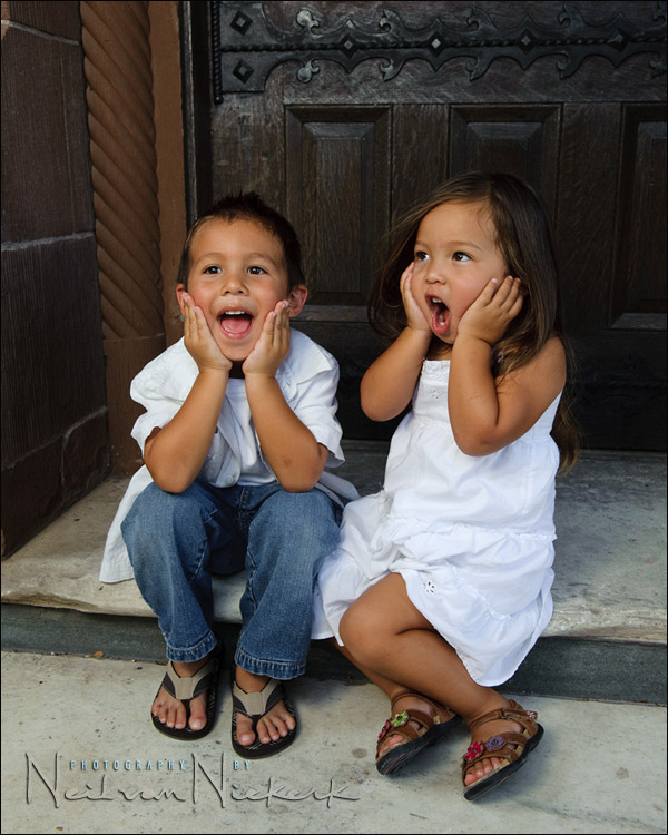
Often when working in the shade, or anywhere we need Cloudy or Shade white balance, we’ll often see a blue tint in the white clothing. I suspect this might be due to detergents being used which give a blue-ish tint to white clothing to make them appear cleaner. Or perhaps this is from UV light when we’re working in cloudy conditions or in the shade. However it might be, we will often get that blue tone in white clothing, as in this photo below …
Look at the white dress especially. There is a distinct blue tint to it.
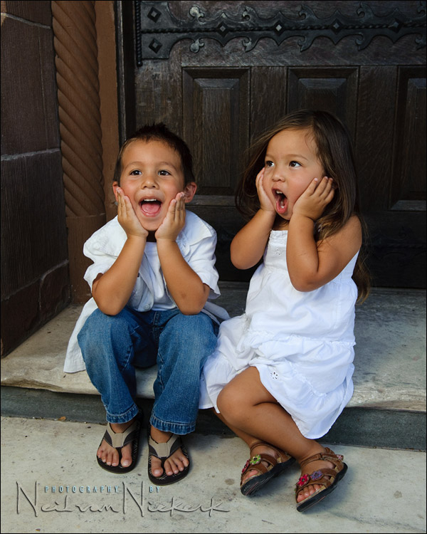
Merely using the eye-dropped tool to click on the whites to give a neutral white, will often give us a far too warm image, as in this example below. The whites are now technically neutral, as per Photoshop .. but the skin tones are too warm.
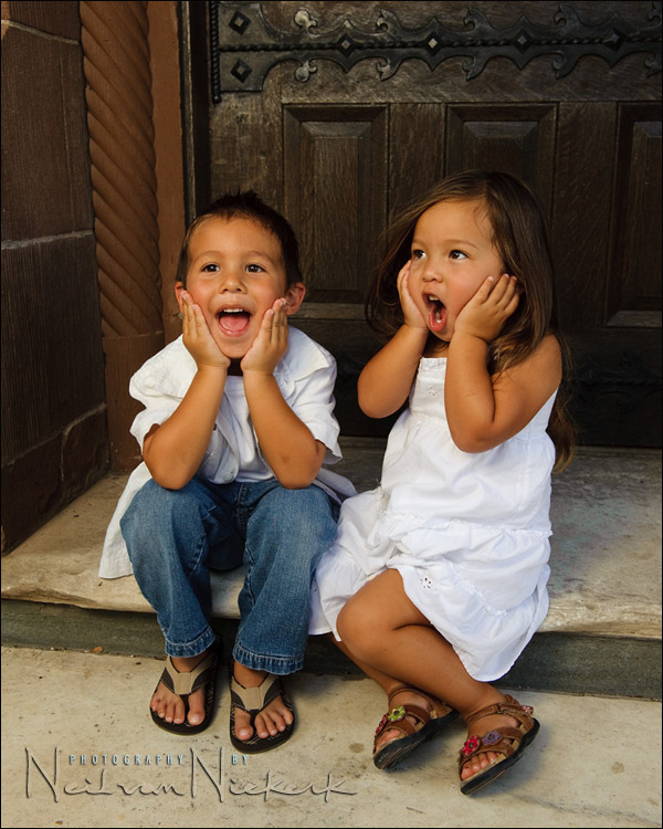
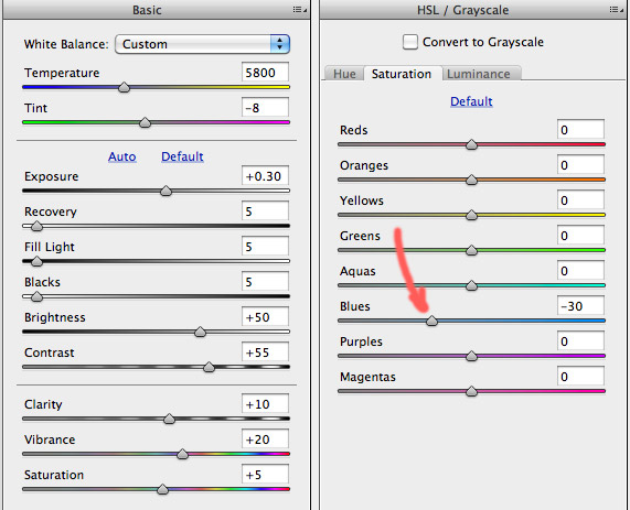
Here is a simple quick-fix trick I use to give me white clothing that actually look more ‘white’. In the HSL tab in Photoshop ACR or in Lightroom, I pull down the blue saturation fader a bit. (The other panel shown here is just to show my basic default RAW settings for this camera. I did adjust the WB though. For me, this is a quick adjustment when adjusting a number of RAW files simultaneously.
Pulling down the Blue Saturation obviously has an effect on any blue clothing that are worn, and on blue eyes. Therefore it won’t be a viable method when we have important areas that are blue. But most often, when we have predominantly white tones, we can get away with this little trick to give us a more pure looking white, without affecting skin tones. It is really handy when editing wedding images.
Click through this link for the two images for a side-by-side comparison.
Equipment used during this photo session:
Nikon D3; Nikon 24-70mm f2.8 AF-S (B&H); Nikon SB-900 (B&H)
Lastolite EZYBOX 24×24 softbox (B&H)
Manfrotto 680B monopod (B&H);
brass stud to attach softbox to monopod (B&H)
I edit it in the JPG file by using the quick selection tool and then adjusting the saturation.
This way you’ll won’t lose saturation in other blue area’s.
Another trick would be to use Selective Color in Photoshop. Try the White pull down first, then Cyan and or Blue. This works great because you can also use a mask.
Yep. Another way is to go to “Selective Color” in photoshop, go to “Whites” and then adjust the blue slider.
That’s a really good one Neil, thank you!
Nik Software Viveza also makes it very easy to select the whites and warm just the white.
Couldn’t you eyedrop the stone stairs as neutral gray?
In Lightroom, one can use the targeting icon in the HSL tab to target the white clothing. Click on the targeting icon, go to the white clothing, click-and-hold on the white clothing. While holding, move up or down on the mouse to automatically adjust the colors. The corresponding HSL sliders will move.
I also agree that Viveza makes it easier to alter color casts on specific areas.
Thanks for the info Neil. I’ve been running into this with white wedding gowns.
I just did a family portrait at the beach on a cloudy morning. I encountered the same issue while using the WB sampler in LR. If I sampled their white shirts it was too aggressive at trying to warm things up. I was manually adjusting the WB but I also like the added element of toning down the blue slider to taste.
Thanks again,
Bob
That’s been quite helpful thanks
I just wanted to point out that the blue you see in the white clothes is the scattered blue light from the sky. It is the ambient “glow” during the daytime that can be seen when direct sunlight is blocked out (e.g. shade). Shoot in shade on overcast day with grayish cloud bottoms and the blue will be, for the most part, non-existent.
Neil,
I use this same technique quite often. I have also often posted on the Adobe site asking for HSL to be incorporated into the adjustment brush area. IMO, this would make Lightroom the perfect tool and would cover 90% of the editing process.
With HSL in the adjustment brush area we can simply dial down the blue saturation and paint over the white area only.
Fingers crossed it will be in LR5.
I have a wedding in Denver today and it’s quite sunny out at the moment! However, I’ve found when I set my WB to Cloudy or to Shade, everything is way too warm, not too cool. That is, all my whites have a distinct reddish/yellow cast, not a blue one. This has been the case ever since I had my first Canon digital camera, and has stayed the same through all my upgrades, including the 5D2 bodies I now use. Shooting in RAW makes everything easier, since I can adjust the WB the way I want it (I pretty much know what the Kelvin temperature should be for any given lighting scenario so that’s easy enough to adjust in LR).
Photomatte,
Yes, you are right, I also found Cloudy/Shade too warm, but in the last few years, I’ve been setting my WB in Kelvin, knowing what I like and it’s very easy to apply.
With my Nikon [D3s] in full daylight/sun I set it 5260K; cloudy next setting up around the 5560; shade 5880. However, if full sun and it’s getting late in the afternoon, the temp becomes warmer so sometimes I find myself dropping down to 5000 or 4760, this does make the skin tones great, but any blues really do become bluer. [water/sky]
You can also use [make an action] like I do, a Hue/Saturation layer; minus 65 on the Blues, make sure you invert [turn to black] the mask and brush over the areas of white; even great for other colors overall, like grays especially; with a white brush, which in turn removes blues -65%. Too easy.
With the Hue/Saturation panel, choosing Blues, it’s the ‘Saturation’ slider you move back to -65; brushing with 100% opacity of brush, but also if you find it’s too much, you merely change the Layer’s opacity when finished, don’t try to adjust the brush up/down, too finicky.
Yep, Viveza works, but if you don’t want to spend the money or simply for such a quick fix without having to open the image in viveza, then droping control points on each and adjusting, far easier to use an action in a split second and brush very quickly.
For sure, using PP actions are the way to go, especially if you want to process multiple images at once!