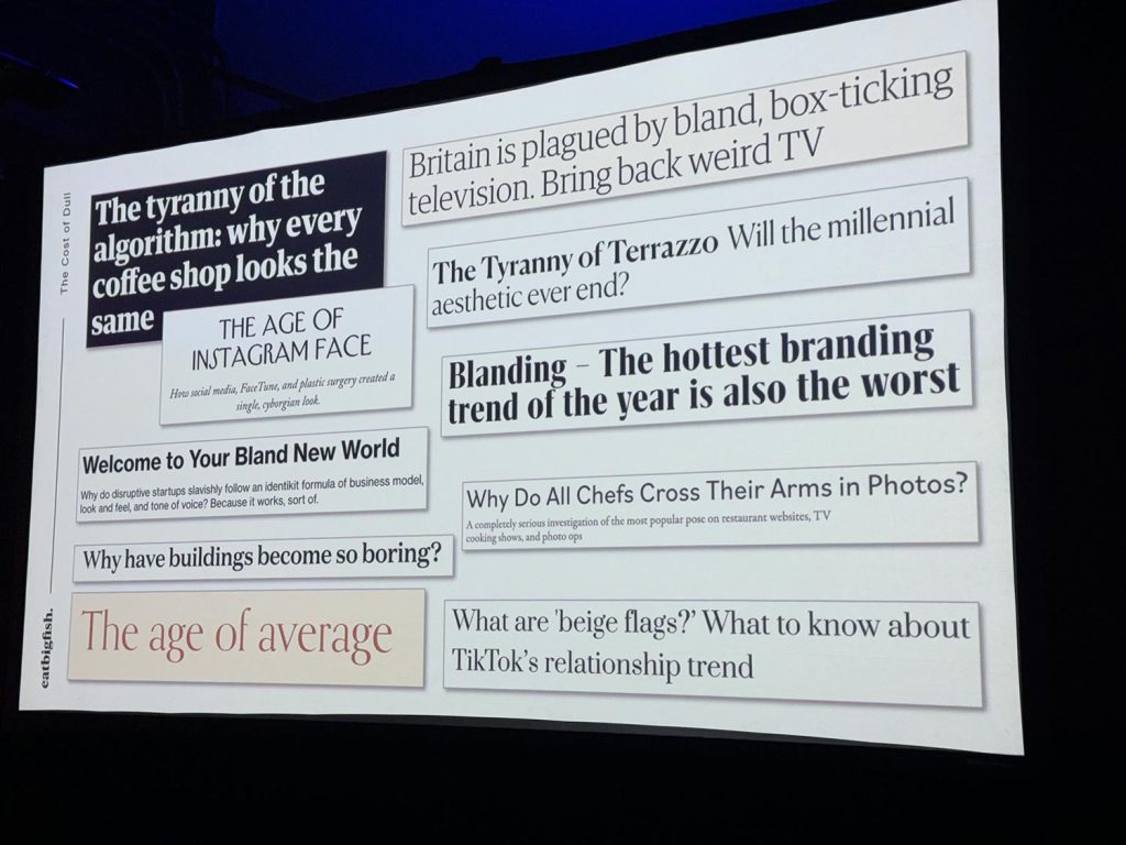
“Why do all chefs cross their arms in photos?” I photographed a corporate event in Manhattan a few weeks ago, hosted by a prominent London-based marketing group. One of the fascinating presentations (by EatBigFish) was about “Blanding” - when branding of so many companies conform to a consistent idea of what branding should look like. This slide summarized many of the themes in the presentation. And I immediately thought of how photographers do the same thing on their websites — posing with their cameras as if to prove they are photographers. It’s a crutch! As photographers we need to Read more inside...
Studio photography : Improvising on lighting setups
Studio photography : Improvising on lighting setups
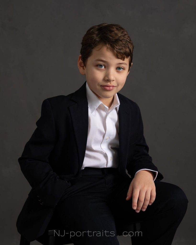
Declan in the studio. This kid, only 8 years old, brought the suaveness and confidence of James Bond to the photo session. It was quite a treat to work with someone so young, but who had specific ideas of how he wanted to present himself, to the extent that this was somewhat of a collaboration. camera : Sony A1 (Amazon / B&H) lens : Sony 24-70mm f/2.8 GM ii (B&H / Amazon) lighting: lots of Profoto gear of course. See the description below for the setup. Read more inside...Dance photography – studio lighting with dramatic shadows

Dance photography - studio lighting with dramatic shadows
Jaqlin and I wanted to create photos in the studio that captured the sheer power in her dance movements. It took several tries for me to get her at the peak of her jump. The lighting here is very simple — a single Profoto B1x 500Ws flash (B&H / Amazon), and the Profoto Magnum reflector (B&H / Amazon). With the flash high up on a light-stand in the studio, I wanted it to simulate hard sunlight, with the shadow of Jaqlin, the dancer, being part of the design of the image. The shadow has Read more inside...Creating AI Art – but now what?
Creating AI Art - but now what?
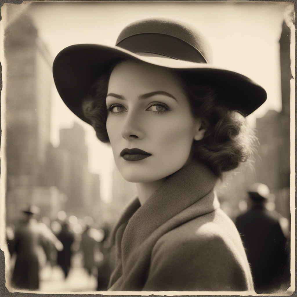
I just paid for a one month subscription to Stable Diffusion AI just to check it out. My first ever foray into "creating AI Art". Here is my 3rd "creation" with AI. And here is the prompt for these 4 images: "sepia tinted black & white photo with distressed edges to the photo showing a truly beautiful woman from the 1930s wearing a hat and a long coat slightly open in the front, flaring from the wind. In the background is an out of focus scene from Manhattan with various buildings and cars and out of focus people" These images look Read more inside...Bounce Flash Photography – directional bounce flash
Bounce Flash Photography - directional bounce flash
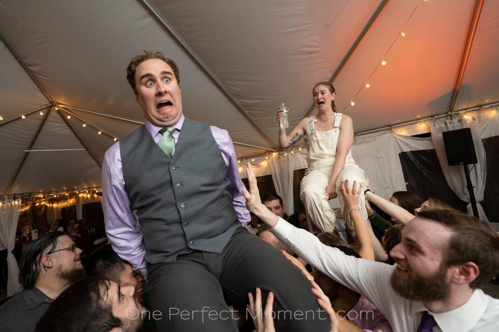
One of my favorite photos from a recent wedding, is this one of the groom and bride being hoisted aloft, with his priceless expression of surprise. Timing and framing is everything, of course. And the lighting. This is pretty much the way it came out of camera, with only minor adjustments to the RAW file. Note that the light on the groom is about the same as the amount of light on the bride in the background. (Yes, she changed into white overalls after jumping into the pool with her dress.) But back to the lighting -- an equal Read more inside...Headshot Photography : adapting the lighting setup

Headshot Photography : adapting the lighting setup
With headshot photography in the studio, there are several setups such that consistently give great, repeatable results. One such lighting setup is Clamshell Lighting, for example. The results are always solid. Just looks great. In this link with articles on headshot photography, you can read up about some of these lighting setups. While I alway enjoy working with clients to give them outstanding headshots and business portraits, it is an extra bit of fun when I meet a client who wants something extra. Something a little different Read more inside...Review : Profoto A2 flash & Clic light modifiers
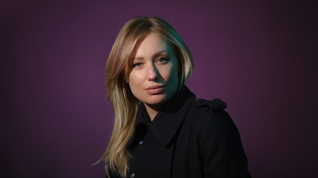
Review : Profoto A2 flash & Clic light modifiers
Profoto has created an entire system of portable lighting with accessories around their Profoto A2 flash (B&H / Amazon). With this behind-the-scenes video, I show how I used the Profoto A2 flashes and accessories during a photo session with a friend, Franklin Elliot, who is a musician and actor (Instagram / Youtube). The intent was to create a series of promotional photos, with a variety of looks. During the extended photo session, we achieved 5 different setups. I want to highlight one Read more inside...A lighting solution for photographing a wedding ceremony in a barn
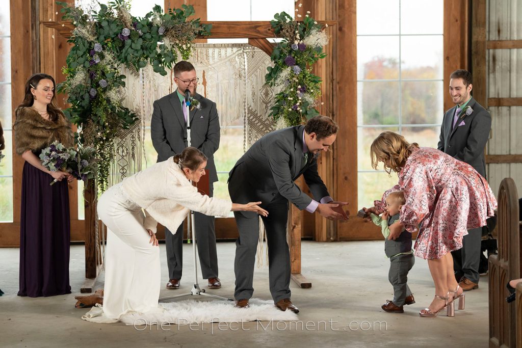
A lighting solution for photographing a wedding ceremony in a barn
An endearing image : the somewhat shy ring-bearer had to be coaxed by the bride and groom to bring the wedding rings to them. Most often, the lighting that I use isn't for dramatic, artistic purposes ... but instead for problem solving. Since it was raining on the day, the outdoor wedding ceremony was moved inside to this large barn. There was very little light inside, and there was strong backlighting. I needed even light, and I also needed to use a telephoto zoom to take photos from further up the aisle. Read more inside...How to get more Bokeh in your photos
How to get more Bokeh in your photos
How do you get more bokeh? Let me explain ... you can't! Using "bokeh" as a phrase like that makes no sense. Bokeh and shallow depth-of-field (DoF) aren't equivalent. DoF does affect bokeh to a certain measure, but it's not the same thing. You can not use those phrases interchangeably. Phrases like "give it more bokeh" hurt our sensibilities because it is nonsensical. Bokeh is a description of the QUALITY of the background blur. There's no QUANTITY to it, hence you can't give more or less bokeh. In this image, shot with a Nikon 50mm f/1.4 Read more inside...Creating dramatic studio lighting with Profoto A2 flashes
Creating dramatic studio lighting with Profoto A2 flashes
Profoto has created an entire system of portable lighting with accessories around their Profoto A2 flash (B&H / Amazon). I had the rare opportunity to connect again with one of my favorite models, Erin Leigh Pribyl, for a photo session in my studio. Even in this short video clip, you'll get a sense of her personality. With this, I wanted to create dramatic portrait lighting with a hint of the old Hollywood Glamor lighting, but with color instead of B&W. In this video is a glimpse of how I built up 4 Read more inside...- 1
- 2
- 3
- …
- 102
- Next Page »