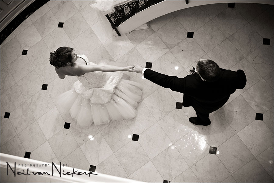
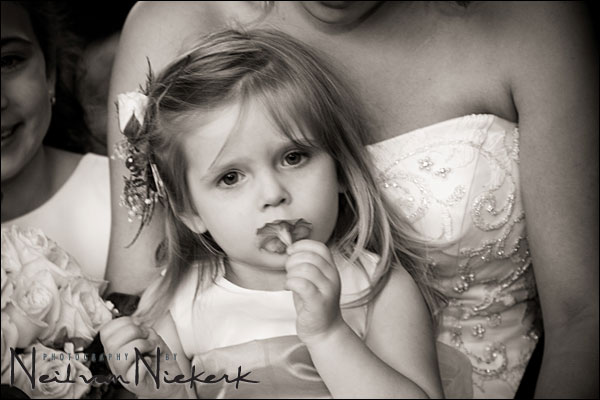
I love color. I see in color. I really favor color over B&W images. But strong B&W images do have impact that is often lost with the distraction of color.
Even though most of the photographs on my wedding photography blog are in color, there was a recent wedding which I showed as a set of B&W images instead. What happened was that when I started editing the images from that wedding for the blog, first one image, and then another, looked really good as a warm-toned B&W … and then I decided to go all the way and create a blog entry that consisted only of B&W images.
.
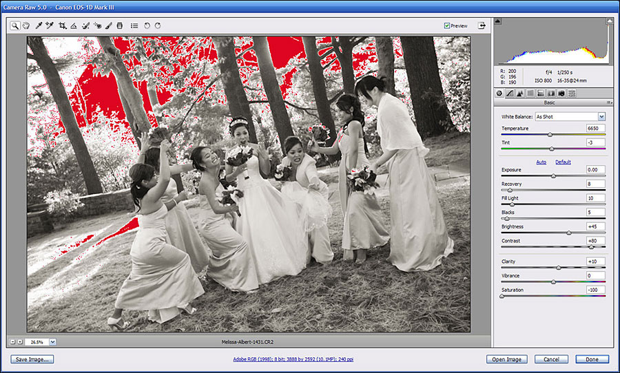
I’ve had a number of queries about how I process my black and white images with that warm tint. It is usually very simply done in Bridge, using a preset I created in ACR. This way I can select multiple images and then select this specific preset.
.
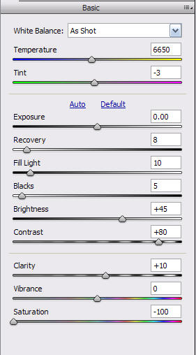

On the Basic tab, adjustments are centered around removing the colour by zeroing the Saturation slider. The Contrast is bumped up a fair amount, and Brightness nudged up a little.
The Calibration tab is adjusted according to suggestions made by Bruce Fraser in his book, Real World Camera RAW. The way that the various colors are interpreted as B&W tones, can also be affected by WB adjustments in the Basic Tab.
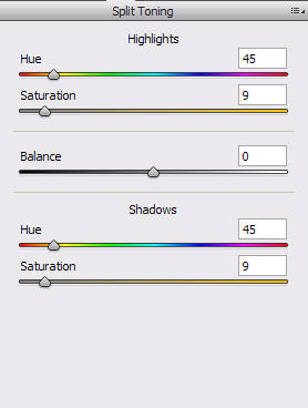
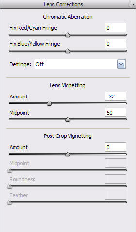
The warm tone comes from adjustments in the Split Toning tab. A slight vignette is also added via the Lens Corrections tab.
I do adjust the contrast and brightness as well as other settings, in order to get to an image that I like.
And that’s how I do it. Of course, the whole wide world is open for adjustment-to-taste according to your own personal taste.
Uh-oh.
You just gave away a trade secret! Even though I don’t use bridge period, I can still grab that subtle warm tone now thanks to your numbers. Then again, what have you been doing here but making the professional tips intelligible to us all?
Once again, my hat’s off to Neil for clearing up even the little obfuscations.
Cheers!
Ahhhh, Bridge and ACR instead of DPP… isn’t life grand?
Thanks for the settings, I’ll give them a try… I’ve got a few B&W settings I always use and it might be time to tweak them a bit!
Great tip Neil. These settings work for Lightroom too, since it uses the same ACR technology as Photoshop. Thanks!
Hi Neil!
Back to colors :
I often notice the dark part your photos are often totally dark. Is it because of contrast or do you intentionnaly cut the low part of the histogram ?
Second question : do you use “clarity” for color photos?
Thanks Neil for your tips, they will help me a lot to process B&W photos. Regards, Chico do Vale.
Thanks for all the tips. I am an amateur photographer…but wants to get good at it…..really good at it. All my friends and people I don’t really knopw thinks I am a professional because I pop my camera and start taking pictures at every event I can find and after give the photos to the host. It gives me a chance to practice and get to show my work….which is very cool. Soon I will have my website on line to show case my work.
Well enough…..to my question. You said that for your B&W you create a preset in ACR? I learned that ACR works only with RAW. Good, but how you create a “Preset” on ACR and then apply them to all of your B&W’s/?
Thanks
Antonio Arias
Antonio,
altough ACR was originally intented for serving in a RAW workflow, it’s an amazing tool for several adjustments on JPEG files either. Sure, for high quality images it’s the usual way to convert to JPEG at the end of the line, but it is good to know, that ACR can handle adjustments on JPEGs very quickly too.
Concerning your question about presets and syncronize: Check out the menus in ACR and you will be able to figure it out for yourself.
Thank you, thank you for this tip! I saved these settings and was able to use the preset successfully already! Your blog is wonderful!
Hi Neil,
Just come across your work, well done just great. Love the warm B&W effect. I am just new to Aperture, can this preset be applied? Look forward to hear from you. Taking delivery of Fujifilm x100 looking forward to use it at a wedding shot.
Regards
Dave