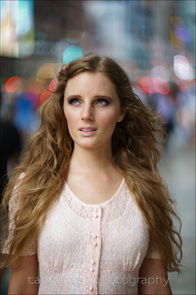
A theme we have touched on regularly here is that “using the available light” is not a random decision. The best results with portrait photography in available light, is when we are deliberate. Deliberate in how we position our subject in relation to the light. This is the central idea in my book, Direction & Quality of Light - posing and lighting are inter-connected. With available light photography, it becomes a little harder to find light that is flattering - compared to using off-camera flash, where you can sweeten the light most of the time with the Read more inside...
Most of the images shot as part of the Sigma 35mm f/1.4 DG lens review, were with available light only. But for one sequence, I used off-camera flash. I didn't intend carrying a lot of equipment, so I stripped it down to the minimum. That meant forgoing my usual softbox, the Lastolite EZYBOX 24×24" softbox (affiliate). Instead, I opted for the much smaller Lastolite 8.75" speedlight softbox (affiliate). And instead of a light-stand, Nicole's friend, Andrew helped out on the day by holding the softbox and slave speedlight.
In Read more inside...
I have to admit upfront that I am a lens snob. Not so much for a lens being esoteric or collectible, but rather that I have a particularly strong preference for the name brand lenses. When I shot with Pentax way way back, I only used Pentax lenses. Similarly, I only have Canon lenses for my Canon bodies, and Nikon lenses for my Nikon cameras.
Part of it is that the styling of the lens and camera is more consistent. Yes, I do like my cameras to have a certain aesthetic appeal. I know, I know ... how pretty a lens looks has no real correlation to Read more inside...
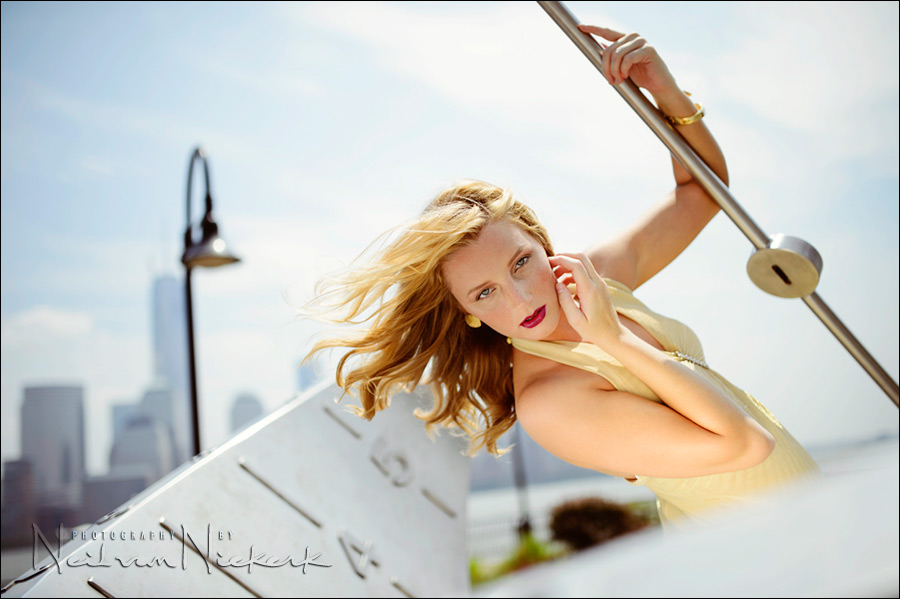
Photographing a model on-location: the progression of an idea
As often happens for me when working a model on location, the final photographs are the result of a progression of an idea, rather than a fully-formed idea from the start. That colorful background came to be because of how I gelled for the flash. It's a technique I've shown a few times, and here it helped me in bringing a blah scenario up to something more eye-catching.
The idea is to create an interesting shift in the color balance between your subject and background. It works especially well if the background is not Read more inside...