If you are new to processing RAW files, you might be slightly disappointed that the images look more flat than what you saw on the back of your camera. This is because the original default in how the RAW file is views in Lightroom (or Bridge), is "flat". No adjustments applied. If you want your images to have more pop to them when you first view then in LR or Bridge, you need to apply different defaults for your RAW files.
Here is how I set up my new baseline for RAW images, so that for a volume workflow, I start off with an image which Read more inside...
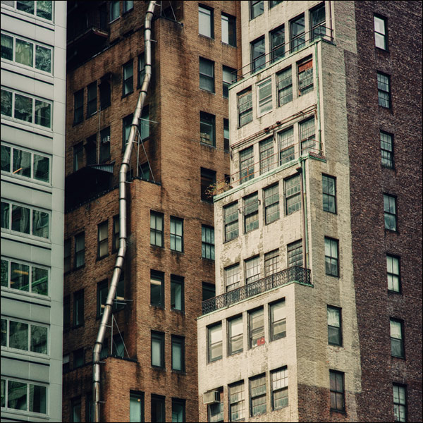
Tilt-shift lens vs perspective correction in Photoshop / Lightroom
Using the Lens Correction / Transform tools in Lightroom and Photoshop, you can make quite radical changes to the perspective of a photo. You can change and skew the vertical and horizontal lines easily, and convincingly.
Since it is now much easier to to correct for leaning vertical lines when photographing buildings with a wide-angle lens, I thought it would be a good comparison to use a Tilt-Shift lens and optically correct for the verticals, versus doing so in Photoshop or Lightroom.
For comparison images, I Read more inside...
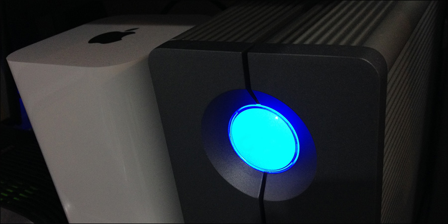
Backblaze is part of my back-up system which I use to ensure that data loss won't happen. It is important to have your files backed-up to the cloud, and on extra hard drives at home or the office. Ideally a RAID array of some kind so you don't rely on a single hard drive. I want my data backed-up on a RAID array with redundant hard drives. For this, I use Drobos with dual redundancy. It is crucial to have off-site back-ups of your files that are continually updated as you work. Backblaze is so easy to use, and so affordable, that there Read more inside...
"My hard drive has died – what should I do right now!? I don't know what to do!"
These were the sounds the angry woman next to me at the Apple Store counter made, while crying about her hard disc that had died.
"But it was fine this morning!"
My sympathy was more with the blue-shirted geniuses who took her anger with a calmness that was impressive. My sympathy for her? Well, I just thought to myself, "Now here is someone who doesn't understand the concept of single point of failure."
Back your data up, all the time. Constantly. Read more inside...
Wedding photography: 3 tips to speed up your editing workflow
One of the questions that came up during the Q&A at my presentation at B&H, was how long does it take me to edit a wedding. Well, the ideal is that it takes me less than a day. During the peak wedding season around September and October, it is easy to slip behind, but that still remains my goal - to edit a wedding during the week right after the wedding took place.
There are several things motivating this idea:
I am more likely to get print orders from the guests at a wedding if the event is still fresh in Read more inside...
Photographers - workflow and back-up plans for disaster
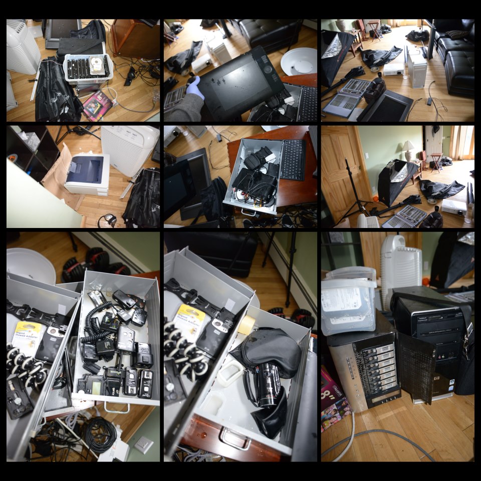
The photo above is of a photographer's studio in New York state, showing the damage that was caused by unexpected flooding during Hurricane Sandy in 2012. For all the damage to photo equipment and computers, no data was ultimately lost! (Photo used with permission.) My own family was very fortunate in that we were not hurt or sustained any damage to our property. The worst we had to endure were the four days without power. There are so many heart-rending stories of lives lost and lives disrupted with the storm, that it just Read more inside...
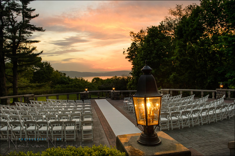
This photograph of the outdoor wedding venue gives a great sense of what it looked like there at the time. But the original image looked a lot more dull. There just isn't a way to capture the deep shaded areas and the bright sky with a single capture, in camera .. without some post-processing work. Get it right in camera? ... sure, but on occasion some post-processing helps. Read more inside...
Photography workflow - Back-up plans for the main computer
The photograph above was shot with my iPhone while I was waiting for a corporate photo shoot to commence. The sky over lower Manhattan was grim and rainy. You can see the reflection of the fluorescent lights inside the room. This gave the city scene a Blade-Runner-esque feel. And with that, this image is perhaps suitably Apocalyptic for this topic - what are your plans for catastrophic failure of your main computer?
The idea for this article comes from a discussion with another photographer - she cringed every time I Read more inside...
your best digital work-flow tip / your best office work-flow tip
I'm once again on a mission to get more control of office work-flow, and to streamline my digital work-flow even further. De-cluttering my desk then made a big difference. Adding some pieces of technology in a more sensible way to my office too, made my life easier and allowed me to work faster. Well, I'm again changing a few things to improve my work-flow. (More about this later perhaps).
In a kind of parallel to this, there was the recent article on the extra items in your camera bag - with some ideas on Read more inside...