
Post-processing workflow: Removing color banding in photos
Post-processing workflow: Removing color banding in photos
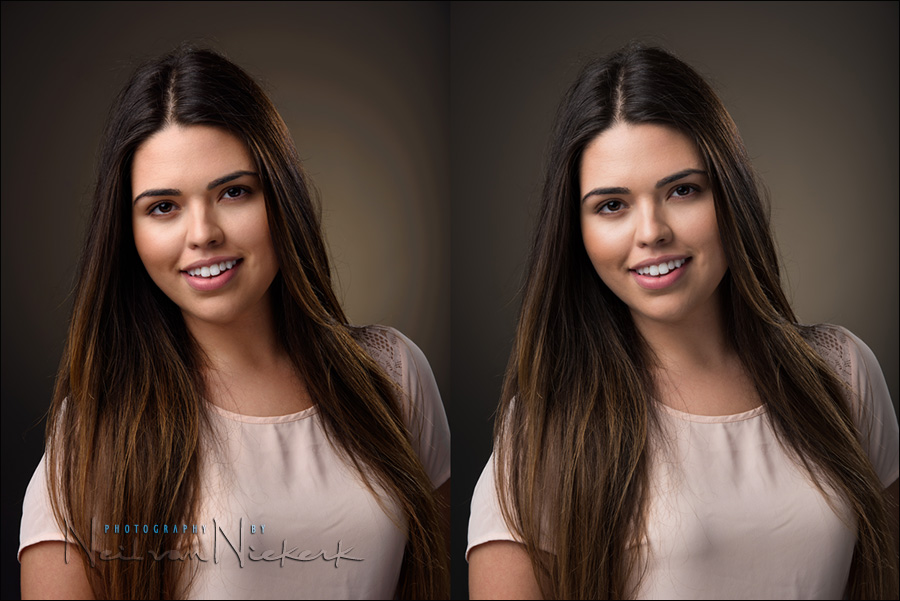
Photographing people in the studio against a darker background, I've been plagued with banding problems. Some of it had to do with the limitation of working in an 8-bit environment in Photoshop. As described in this article - how to deal with color banding - a work-around was to editing images as TIFF, and thereby skipping a few steps where I would previously just have edited the JPG. The additional info in the TIFF file minimized color banding. But then with darker backgrounds which have a bit of color in them, the Read more inside...Post-processing workflow: How to deal with color banding
Post-processing workflow: How to deal with color banding / posterization
If you've ever noticed banding or posterization in your photos, where you'd expect solid colors, then there's a relatively easy fix for it. This posterization effect appears as bands of colors, where the transitions between similar tones aren't smooth, but have jagged edges instead. It is caused by the 8-bit JPG not having enough data to give you a smooth gradient when large blocks of color slowly change. You'll often see it in the blue sky in landscapes, or as in this case, with large areas of color in the Read more inside...a favorite image – before & after (model: Anelisa)

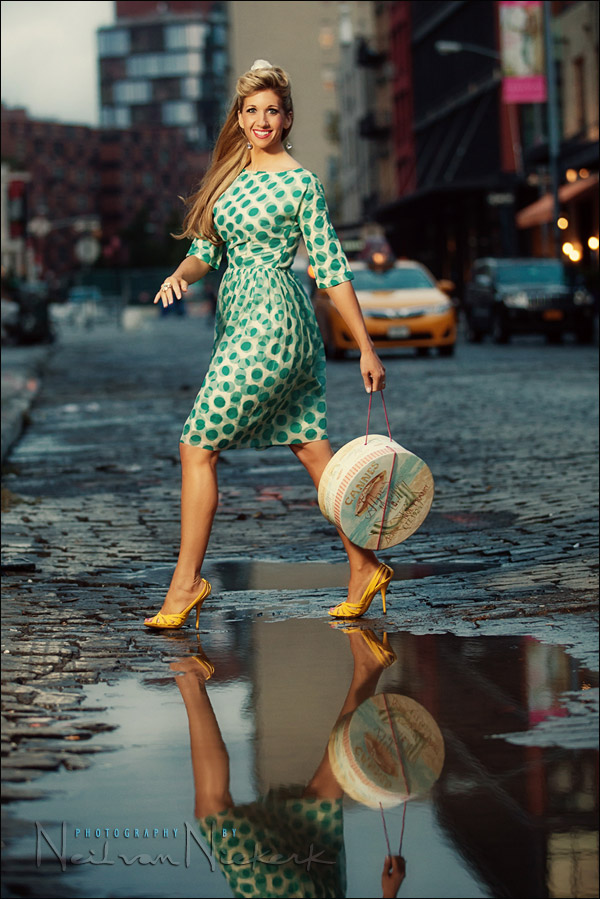
a favorite image - before & after (and the how to)
There's something about this photograph that I really like ... aside from Anelisa being one of my favorite models. It is slightly surreal with Anelisa's apparent levitation. The dress and hat is reminiscent of a 1950's Fashion, and Anelisa's mid-air pose is also reminiscent of Philippe Halsman's iconic jumping images. All that, combined with the sun flaring across her face and the washed-out background, all adds to this wonderfully nostalgic mood. Read more inside...Wedding photography: 3 tips to speed up your workflow

Wedding photography: 3 tips to speed up your editing workflow
One of the questions that came up during the Q&A at my presentation at B&H, was how long does it take me to edit a wedding. Well, the ideal is that it takes me less than a day. During the peak wedding season around September and October, it is easy to slip behind, but that still remains my goal - to edit a wedding during the week right after the wedding took place. There are several things motivating this idea: I am more likely to get print orders from the guests at a wedding if the event is still fresh in Read more inside...Bounce flash portrait & post-processing
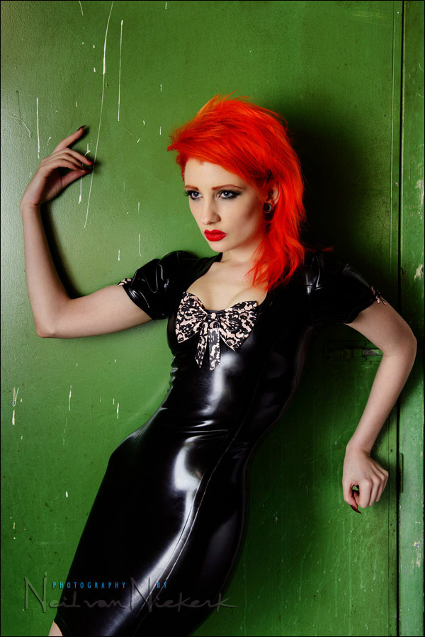
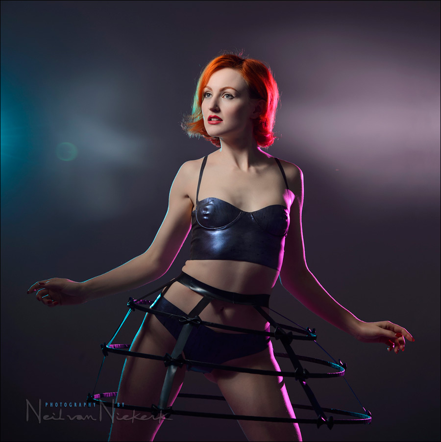
Bounce flash portrait & Photoshop retouching technique
When we were done with the studio shoot with Ulorin Vex, we still had a few minutes left, so I thought I could do a bounce flash portrait as well. Just for a comparison of sorts to show that on-camera bounce flash can give interesting results too. Here is the low-key portraits we did with the Profoto set-up. The only semi-interesting background I could find in the studio (that wasn't a white wall), was this grungy green door to one of the store-rooms. I thought it might work as a gritty urban setting. I shot about eight Read more inside...Vintage photo session and Off-camera flash
Vintage photo session and Off-camera flash
Anyone who regularly follows the Tangents blog or has my 2nd book, off-camera flash photography, might recognize Sarah. When she told me she was visiting New York, I made sure that I squeezed in a photo session with her in my schedule. The weather on the day was grey and drizzly ... enough reason to juice it up with some off-camera flash. And then play with the images in post-processing a bit. On this rainy day there were random pools of water in the street, and it took just a few minutes to find a viewpoint where we could get Sarah's Read more inside...Lightroom tutorial – Local adjustments
Lightroom tutorial - Local adjustments
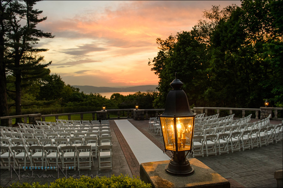
This photograph of the outdoor wedding venue gives a great sense of what it looked like there at the time. But the original image looked a lot more dull. There just isn't a way to capture the deep shaded areas and the bright sky with a single capture, in camera .. without some post-processing work. Get it right in camera? ... sure, but on occasion some post-processing helps. Read more inside...Photoshop tip – easy effect for more punch to your photos

Photoshop tip - easy effect for more punch to your photos
Here is a well-known Photoshop technique - one that I like and use on occasion. It desaturates the photograph, while also compressing the tonal range. It creates a modern look that also looks quite trendy. It is also quite easy to apply, by dragging the layers from a reference image once you've set it up. Starting with the original image, I add these two layers: Read more inside...Photoshop actions to help with Post Processing after RAW conversion

Adrian, a regular follower of the Tangents blog, (better known as the ever-helpful Trev in the Tangents forum), has the guest spot this week. Adrian has expanded on his explanation of the actions that he mentioned in the comments section of the recent article on Selective Sharpening in Photoshop. Even better, he has made it available as two downloadable actions as well.
Photoshop actions to help with Post Processing (free download)
guest post by Adrian, at Five Star Studios wedding photographer, Mackay, Queensland in Australia The following downloadable Read more inside...- « Previous Page
- 1
- 2
- 3
- 4
- …
- 6
- Next Page »