Posing people: Tips for improving your portrait photos
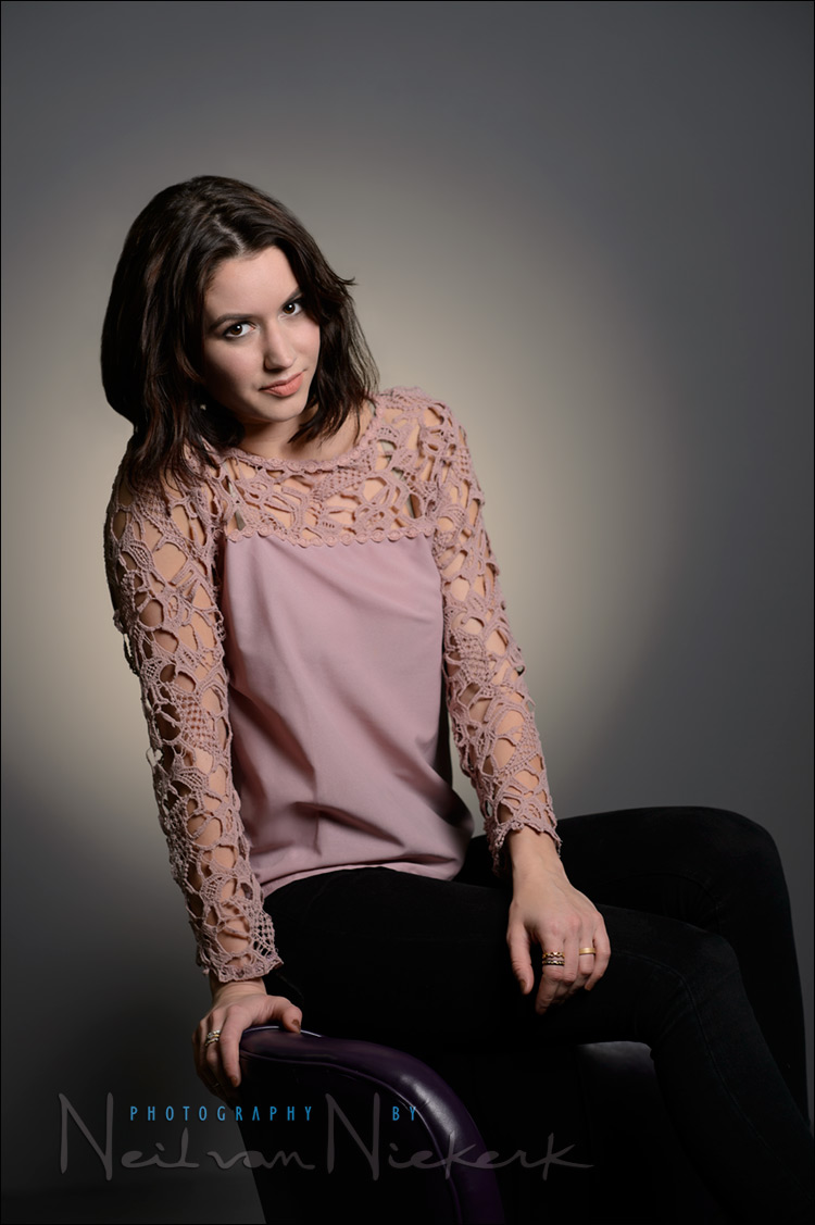
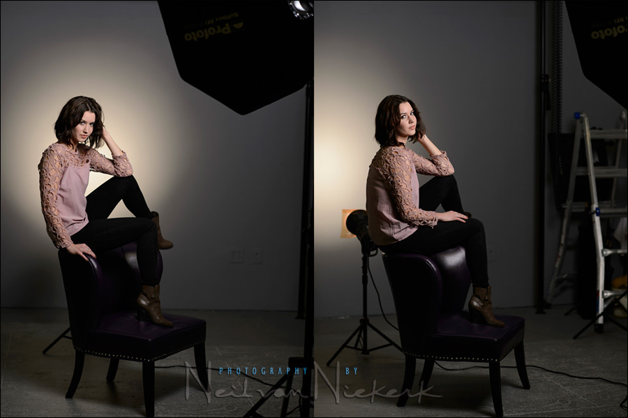
Throughout the numerous articles on the Tangents blog, I’m often asked about how I go about posing people. I’ve described some of it in the article, adjusting a pose with incremental changes. Instead of a traditional way of posing, it’s mostly a “feel” thing, looking at my subject and seeing if there are elements that could be better balanced. This studio portrait of a model, Adrienne, doesn’t follow rigid guidelines of formal portraiture. Her shoulder is a little scrunched up, and her head is tilted to the side. Yet, to my eyes, this works. There’s a “looseness” to it. Yet, I did adjust a few things before firing the shutter.
That is a constant for me – I wouldn’t just fire off frames without being at least partially satisfied how my subject appears in the frame. It’s that delicate balance between maintaining spontaneity (and capturing some of the real personality of your subject), and controlling what you see in your frame. Just firing off frames will rarely give you many successful images.
For all that though, the moment and expression trumps technical perfection. It’s not an excuse to not put in the effort to excel — it’s permission to be okay with a photograph that is awesome despite what might technically be seen as flaws.
In posing someone, there are a few things I immediately look out for:
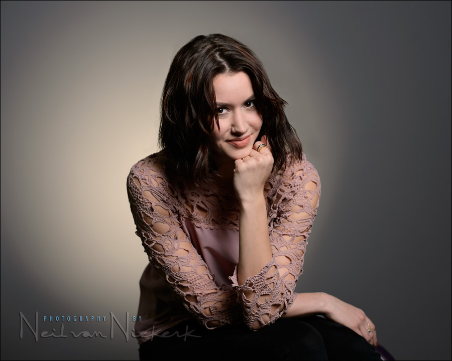
This photograph shows a few of the things I try to avoid when posing people:
- The hand square-on to the camera. It usually looks better if you can see the edge of your subject’s hand. Also, the hand usually looks better placed as an S-curved shape, rather than a straight line with the fore-arm.
- She is too hunched over, without there being intent in the pose.
- The light is too high / her face has dropped too low. This is an important consideration – posing and lighting go hand-in-hand. Here, her eyes are nearly shaded by her brow, and you can see the shadow of her nose dip too low, nearly touching her lips. I could either move the light, or ask her to perk up a bit – which solved the hunching pose as well.
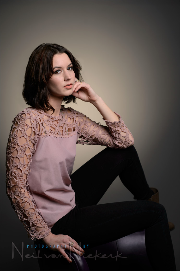
Then there are other things I avoid as well:
- 1. Fore-shortening of the limbs. We see in 3 dimensions, but with photographs we lose the dimension of depth. So if an arm is extended to the camera, it can often just look plain weird due to fore-shortening. i.e., the arm becomes “shorter”. With this in mind, I usually try to (very loosely) have limbs in a plane parallel to the camera.
- 2. A “flat” stance. With standing poses, I invariably start by having my subject place their weight on their back foot, and then the other foot is swept forward a bit. That’s just to start with. From there I adjust the pose if necessary.
Note here in this following image how her arms and legs are parallel to the camera, to avoid fore-shortening. I then had her rotate her shoulders more open to the camera.
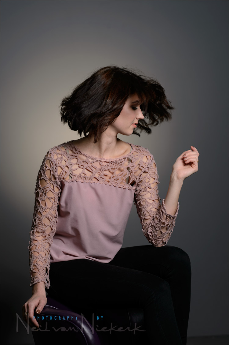
Adrienne, swinging her head to swirl her hair for a few photos.
The lighting setup:
Camera settings & photo gear (or equivalents) used in this photo session
- camera settings: 1/200 @ f/9.0 @ 200 ISO
- Nikon D4
- Nikon AF-S 85mm f/1.4G / Canon EF 85mm f/1.2L II USM
- (2x) Profoto D1 Air 500Ws studio lights
- Profoto RFi 3.0′ Octa Softbox
- Profoto 7′ Grid Reflector with a Profoto 10-degree Honeycomb Grid
- Rosco Cinegel 1/2 CTS #3442 for the warm background
The warm halo in the background is from the gridded light behind Adrienne. I added the 1/2 CTS gel (affiliate) over the background light for that warm tone. The background light can be moved closer or further away from the wall to change the size of the spot.
The main light on Adrienne is the 3′ Octa. For on-location work, I have the Westcott Rapid Box 36″ Octabox (B&H / Amazon) which opens up (and collapses) very quickly. It’s definitely worthy of consideration if you want a fairly large on-location light modifier that is easy to carry, and easy to set up. The Westcott Rapid Box comes in all kinds of mounts, including Profoto, AlienBees, Bowens and Elinchrom.
Related articles
- lighting
- Using the beauty dish as a single light source (model: Brian)
- Portrait photography & studio lighting – influences & inspiration (model: Viktoria)
- Studio photography: low-key lighting for a dramatic portrait (Randy)
- posing
- Adjusting a pose with incremental changes (model: Irene)
- Pose the hands – asymmetry (model: Anita)
- Posing tips – the leaning pose (bride: Patricia)
- Adrienne’s website
Hi Neil, great tips and advice, as always.
Unrelated to the topic of this article, is there some major posterization in the gradient of the background in the first image? Perhaps a side effect of compressing the image for web? There also seems to be a shift in colour between the second and third images.
The posterization is something I struggle with every time there is a gradient in darker areas. Just like this.
I do my editing on the image as a 16-bit TIFF … but the transition to 8-bit web-sized JPG, brings some of the artifacting back that I had been trying to avoid.
I hear you…I have the same issue when shooting stuff like this in the studio (which is rare for me though).
I recall some tricks using blurring in PS to help fix this. Worth it for client files I guess.
I only commented because I recently installed a new video card and I was experiencing a lot of issues with posterization on browser images and in some other applications. I seem to have gotten to the bottom of it, but when I saw these images I was worried that it was back/not fixed.
Thanks for getting back to me so quickly on this.
The only way around it, really, is noise. Add a very small amount of grain to the gradient at the target image size, and the banding will dither out. But then everybody would point out the noise if you post it on a photography-related site (as opposed to somewhere where people look at pictures instead of pixels). It’s the internet; that’s what photographers on the internet do.
Neil, you said, “his studio portrait of a model, Adrienne, doesn’t follow rigid guidelines of formal portraiture. Her shoulder is a little scrunched up, and her head is tilted to the side. Yet, to my eyes, this works. There’s a “looseness” to it.”
I like that. I like that a lot. The more I study photography, the more I see too much emphasis on the way it’s supposed to be rather than the way it should feel and taste personally. “Yet, to my eyes…” I think that concept has become so underrated and underappreciated — so trounced on in the name of PC (photographically correct) — that new photographers, such as I am, can too easily be led to think it’s never okay to take the photo in the way that it speak most personally to themselves.
Professionals have game rules to play by, no question. And images for submission and survey in the amateur world usually have to play by those same rules. but I am just someone who wants to complete something in me when I take a picture, an image that makes me say, “Yeah, that’s it!” without the confines of everything having to be PC. (That’s why I really could appreciate that photo of the dancers you took (in SA?), the one that was the decisive moment in your awareness as a photographer when you knew you could “do it.” I love that photo. Not PC in several ways, as you noted, but who cares! It speaks!
So, thanks, again, Neil, for encouraging us photographers who just want to better our skills for our own purposes (and, yeah, appreciating more the PC end of things).
Hi Neil, I’m really a novice at photography and lighting techniques, but have been reading your site a lot lately trying to pick up what I am capable of understanding! One issue I tend to run into when doing shots like this (typically of my unwilling kids!) is that I seem to get a lot of “bleed” over from my main light onto the background. The only way I can seem to limit it is by using a small softbox angled sharply away from the background, but this often doesn’t give me the light I want on my subject. In your shot, it really looks like the main light is just lighting your subject and nothing else. Do you have any tips or insight into your thought process that you can share about how you are able to use a large modifier on your main light while still just illuminating your subject (apparently) with it? Thanks for all of the great info!
Distance if you have it. Grids and flags if you don’t. Don’t let your lights get further away from your subject than they need to be; fall-off and the inverse square law are your friends. It’s tough to shoot in a small space, but if you have any room at all left over when you’re shooting, it’s far, far better to have the room behind your subject than behind you.
Stan covered that well.
Another thing that I do (because I have the distance in the studio), is to angle the softbox so that any shadow cast by my subject, falls out of the picture frame.
A simple lighting setup for a very effective portrait.
Neil, did you ever try (I am sure you have) shooting thru the Liveview feature? I know it doesn’t show the effect of flash but when shooting available light, do you find it useful?
Not for studio portraits.
Interesting lecture given by Lee Varis https://www.youtube.com/watch?v=HLWh68q_yUI where he tackles the issue of banding. It’s aimed at images for print but might help for web images too.