
Using a gridded stripbox as the main light
Using a gridded stripbox as the main light
As I show in the video clip how to use gridded strip boxes as the main light, I love how I can flexibly shape the light falling on and around my subject. Specifically in the studio, I mostly use the large gridded Profoto 1’x6 strip-box (B&H / Amazon). It is simultaneously capable of dramatic light and soft light. Or an interesting combination of that. More than that, I can vary the interplay between light and shade, by how I swing the softbox around, or rotate it. I often do this while shooting so that I continuously Read more inside...Lingerie photo session in the studio – Lighting, light & textures
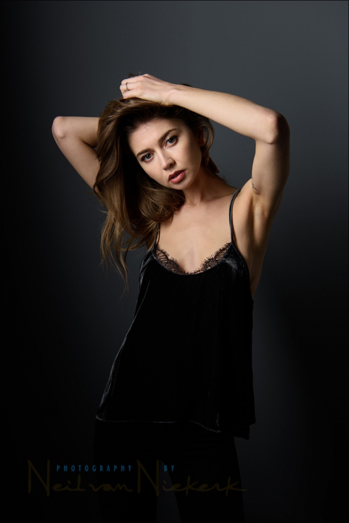
Lingerie photo session in the studio - lighting, light & textures
This photograph of Melanie, one of my favorite models, is one of a sequence where we played with different lights and lighting styles in the studio. I wanted lighting that was both soft and dramatic. Both feminine and bold. The lighting is the same idea - using a big gridded strip-box / soft-box - as I used in a previous photo session with another model, Anita DeBauch. The final image above, is the result of adding texture layers in Photoshop. I wanted to retain her shadow and other detail in the wall, while Read more inside...Bounce flash portrait & post-processing
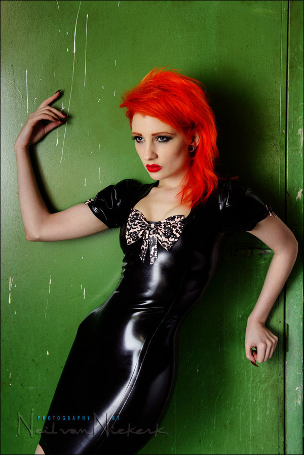
Bounce flash portrait & Photoshop retouching technique
When we were done with the studio shoot with Ulorin Vex, we still had a few minutes left, so I thought I could do a bounce flash portrait as well. Just for a comparison of sorts to show that on-camera bounce flash can give interesting results too. Here is the low-key portraits we did with the Profoto set-up. The only semi-interesting background I could find in the studio (that wasn't a white wall), was this grungy green door to one of the store-rooms. I thought it might work as a gritty urban setting. I shot about eight Read more inside...Night-time photo session using off-camera flash
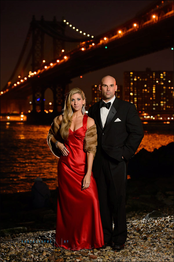
Night-time photo session using off-camera flash
Sarah and Mark were in New York, dressed to the nines, to attend the Rockettes show. And while they were dressed up, and with some time before the show they were attending, we did a photo session. You might remember them as the couple in my book, off-camera flash. I've also photographed Sarah on other occasions. I thought that the New York skyline at dusk would work as a perfect backdrop to how stylish they were dressed. (I did ask Mark if he felt like James Bond, all suited up like that in his tux.) The lighting setup was Read more inside...High-key studio lighting for portraits

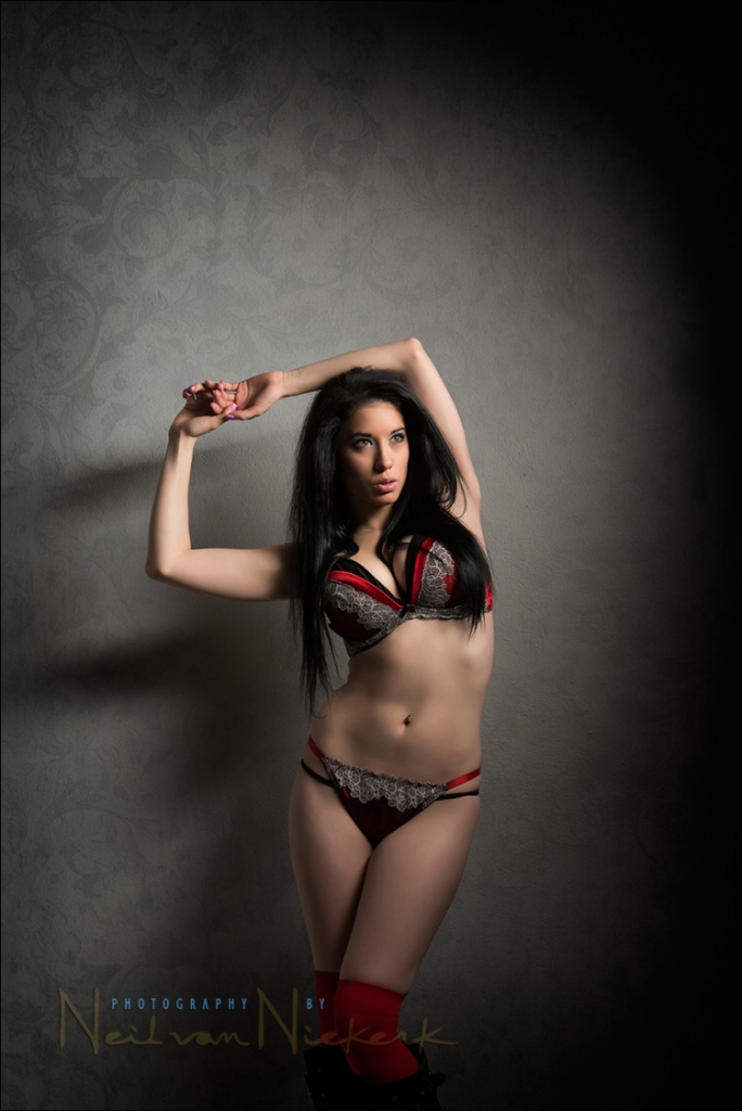
High-key studio lighting for portraits
One of the models that replied to my casting call for a model at my workshops in San Francisco in 2011, happened to be Ulorin Vex. I immediately recognized her, since I've seen photos of her in various portfolios. I was both surprised and very happy, since I regarded her as a bit of a superstar. I scheduled a photo session with her for the day after the two workshops in SF, and the images from those sessions appeared a few times on Tangents, and I'd consider them among the best work I had ever done. It helps to have an inspiring model! Ulorin Read more inside...Photoshop tip – easy effect for more punch to your photos

Photoshop tip - easy effect for more punch to your photos
Here is a well-known Photoshop technique - one that I like and use on occasion. It desaturates the photograph, while also compressing the tonal range. It creates a modern look that also looks quite trendy. It is also quite easy to apply, by dragging the layers from a reference image once you've set it up. Starting with the original image, I add these two layers: Read more inside...Photoshop actions to help with Post Processing after RAW conversion

Adrian, a regular follower of the Tangents blog, (better known as the ever-helpful Trev in the Tangents forum), has the guest spot this week. Adrian has expanded on his explanation of the actions that he mentioned in the comments section of the recent article on Selective Sharpening in Photoshop. Even better, he has made it available as two downloadable actions as well.
Photoshop actions to help with Post Processing (free download)
guest post by Adrian, at Five Star Studios wedding photographer, Mackay, Queensland in Australia The following downloadable Read more inside...photo session – vintage pinup style (on location)

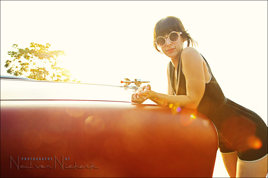
photo session - vintage pinup style (on location)
When the hot-rod show which didn't offer as much in terms of photography as I had hoped, Jill and I moved over to the pier in Brooklyn. Having a model in a retro sailor-suit type outfit ... well, it just seemed to good an opportunity to waste. I thought of perhaps using the Ice Cream Factory there as a backdrop to a straight-forward pinup photo, but ultimately decided the Hudson River waterfront would work better as a setting for the photo. Then we just had to add some simple but dynamic lighting, and give the final image a vintage Read more inside...post-processing a photo – that summery feeling
post-processing an image - that summery feeling
A hot rod show & hot girls dressed in 50's retro outfits .. it all just has to look good! Well, not necessarily. Sometimes the way you feel something should look, just isn't quite there in the actual setting. At a hot rod show today in Brooklyn, though there were the usual awesome cars (and girls), but the show was held under an expressway. Just not quite the right setting to easily get images with sparkle. But parked around the area were some vintage cars, so along with Jill (one of the models), I used some of these cars for a few Read more inside...- 1
- 2
- 3
- 4
- Next Page »