directing & posing – using randomly found available light as portrait lighting
During a trip to California, I was keen to meet up with another favorite model, Bethany. We were allowed to shoot in a night-club on a Sunday afternoon when it was all quiet with no one there. It’s an interesting place to work with a beautiful model, and I had a multiple-flash setup ready to use.
However, the first series of photos of Bethany was shot with just the available light there. But first I had to recognize the light as being interesting light for a portrait. I had to “see” it first. As it happened, I only recognized that this might be useful light for a portrait when I did a few test shots while Bethany was having her hair and make-up done.
As photographers we should always be aware of the light, and how the interplay between light and shade affects our subject. And how the quality and color of light changes. Sadly though, I didn’t recognize that the light was interesting just by looking at this scene. I only saw it once the test images popped up on the back of the camera, and I went hmmm!
Here is a pull-back shot to show the light sources – the main light was simply that bare incandescent light-bulb which the make-up artist used to do Bethany’s make-up. Simple as that.

The magic happened in how the warm Tungsten light worked with the much colder existing light within the night-club. I’m not sure what the other light source was, but it looks like it might be Daylight balanced light-sources in the night-club. Perhaps more blue / colder than that. Whatever it was, it looked great in that first few shots of Bethany’s prep.
When Bethany was ready, this is then where we started.
posing and directing a model
When working with hand-held video-light, we most often work by moving the light until it falls onto our subject in a way that is flattering. But with the single light-source now being static, I had to direct Bethany so that the light shining on her was flattering. It helps in that Bethany is an experienced model, being able to work with very little direction from the photographer. But she, like most models, will have no immediate idea what the photographer is attempting in terms of lighting. I did show her the test shots during prep, so she knew what I was after, but she still needed to be directed.
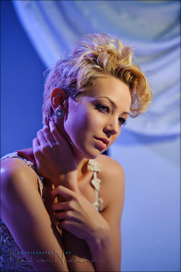
In posing her, I had her leaning into the light a bit, taking care that I got loop lighting. The way that the shadow falls under her nose, means it is just that ‘loop’ of shadow there. It is most often the way that I use a hard or small light source. It keeps from weird shadows falling over your subject’s mouth, or a strong shadow of your subject’s nose falling across their cheek. So I tend to keep it simple like this, since it is usually the best place to start and get good results immediately.
Now it was just a matter of a few quiet instructions like, ‘drop your chin a little bit’; ‘turn your head slightly more to me’ … until the light looked good falling on her.
And there we have the resulting photograph.
camera settings & photo gear (or equivalents) used during this photo session
- camera settings: 1/60 @ f2.8 @ 1000 ISO
- Nikon D3;
- Nikon 70-200mm f2.8 AF-S VR II / Canon EF 70-200mm f/2.8L IS II … zoomed to 155mm
related articles
- off-camera flash – creating separation with back-lighting (w/ Bethany)
- multiple off-camera flash – gelling your flash for effect (w/ Bethany)
- mixing the white balance of different light sources (w/ Bethany)
- photography: direction of the light – using available light (model: Shawna)
- tips on posing people / working with a model
Amazing portraits and skin tone! The skin tone is influenced only by the white balance? Because in the pull-back shot the skin has a different temperature. The correct skin tone became a goal in my life, until now it’s more a guess for me.
Thank you.
Neil,
Excellent photos as always. I need to work on my visualization. My routine has been like “I think this is interesting.”, shoot a test shot, and then adjust without strongly considering how the lighting pattern will look beforehand.
The shadow formed on the right side of her face causing a gradient going into clearer light was spectacular.
California was good to you Neil. I love how the cool blue backgrounds here contrast with the red hot backgrounds on the Ulorin series from the past week…talk about fire and ice!
Excellent. Yes indeed! How do you get the amazing skin tones? Is that something that you could share?
Thanks.
Arturo
great post as always Neil! your blog is always part of my daily reading!
Nice. That 70-200 is so sharp at F2.8 and 1/60.
Hi Neil,
You mentioned that you use Camera Portrait Profile in ACR. I assume it is the Nikon version of the Portrait profile stored within the camera body you use?
Do you make any in-camera adjustments that you find helpful and time saving in post-processing?
For example, I personally keep white balance shifted to A3, for a slightly warmer AWB setting. I find that A3 tends to disable to “bluish” tone AWB sometimes creates. Since i shoot in RAW i always have a chance to adjust WB to my liking anyway, but on several occasions i found A3 to be just where i wanted it. Also, since i shoot with Canon, I make slight adjustments to the picture styles (for example: boosting saturation, contrast etc). For portrait profiles i found that a slight increase in saturation and A3 WB shift together with Canon’s P-Snapshot produces a nice combination.
Thank you!
Neil,
As usual a great portrait.I have a question.
The shadow on the right of Bethany’s face is so perfectly correct – not too light ,not too dark, and to my opinion is a real plus to this photograph, so how do you manage to get this ratio.do you measure with the flashmeter and what would the difference between the bright part of her face and the shadow part be ? a little less than 1 diaph ?
Thanks
Wow, The final image of this set is just amazing, the motion the pose the perfect shapes of her arms at the edges of the frames, and don’t forget the lighting; very nice.
Thank you for clarifying my question Neil. I worked with DPP a lot and only recently changed to ACR. Thanks for the info!
Hi Neil,
Thanks for your recommendation. I have just ordered from Amazon the first book on that list you sent.
Alfredo
Beautiful shots as always Neil. I’m liking the work you have been publishing here recently with models, it’s interesting to see the difference between your wedding/portrait/model work.
My one comment on the first image (and I’m really not qualified to criticize!) would be that, knowing that you use the Portraiture plugin as part of your workflow, it seems that because it is using skin tones as a target for smoothing etc. it has evened out the skin of the model a lot more where the natural light falls on her as opposed to the cooler tones where the texture hasn’t been smoothed so much. I think in this image, as the difference in texture isn’t huge and the colour temperature of the light is different, it works but was curious if this was a conscious decision or not?
Portraiture works predominately on the reddish/yellow hue/saturation range since skin tones are invariable that colour.
Even if you use the eyedropper from the Skin Mask section on the left hand side of Portraiture, and clicked in the really bluish skin tones, nothing will change, even the blue background is ignored since Portraiture is trying to adjust the red/yellow hue range ignoring blues.
You can even adjust the area selected by placing your cursor in the skin mask range colour pallette and selecting either the sides or top/bottom of the white box and dragging them out, or in the little colour bar beneath the main colour box and expand/contract the range on the sides of the box.
Even if you grab the main box in the Skin Tones Mask area of the colour panel and slide it all over the place, you will see only reds/browns/yellow/light/grey, hue/saturation, no blues.
A simple test, in the Skin Tones Panel, next to the ON button there is a drop down menu, select Custom, then click on her forehead, you will see the tone selected in the colour panel. Just the one click.
Now, to see what’s only going to be affected, next to the main colour box where you see Show Mask, it will be default to None, select White and you will see your main image show the precise areas affected.
Go back to None, click on the red part of her cheek, next to the yellowy tones, but NOT in the blue tones, you will see the box expand in the colour panel to include that area also, check with Show Mask to White, then go back to the None and click anywhere else then on either the blues in her cheek or the blue background, nothing will change, it ignores the blues.
Hope this help explain how Portraiture works.
Cheers,
Trev
Thank you, Neil. About the motion of model in the last photo and how to achieve that, I believe you’ll tell us in another wonderful post.
Really interesting about the Portraiture smoothing. I would have guessed it has a bit more to do with the angle of light coming in from that side, where texture is so deep that the software would have to slip into a much higher “gear” to get the same amount of smoothness. I don’t use that software, but it sounds great.
Neil,
how you recognize the available light ? Only by looking at the scene with “naked eye” or by some test shots ?
Both.